Tutorial: Creating a Data Visualization with Google Sheets and the Media Suite
Jasmijn van Gorp & Mary-Joy van der Deure, Utrecht University
Tutorial description, case and objectives
Archives preserve copious amounts of metadata, meaning the data that is needed to describe and organize the collections in the archive. Metadata, however, can also be the subject of analysis in itself. What is important to consider is that (meta)data are never neutral representations, but that they are shaped by social, technological and spatial practices that all leave their traces. Yanni Loukissas (2019, 189) argues that, instead of considering data as “information at a distance”, we should analyze data’s “locality.” This means we connect the “data back to the context in which they are produced” (D’Ignazio and Klein 2020). Through this approach, the metadata in the archive can provide insight into how the data are made. Loukissas shows specifically how errors and absences can point to ‘local practices’. For example, when working with digital scans, visible fingers or crumbled pages can be left behind during the scanning process, making these errors a trace of the data’s production (Thylstrup 2019, 42). The same goes for the data that is missing. Absences are traces of the decisions made by archivists, influenced by policies and specific historical contexts, who decide what will and what will not be preserved (Uricchio 1995). Errors and absences are not just ‘data dirt’ but interesting traces of the data’s local production context.
In this tutorial, we will practice this approach by looking at a dataset and creating a data visualization of metadata in Sound and Vision’s television collection. Specifically, we will analyze the metadata of news broadcasts on the Chernobyl nuclear disaster. In 1986, a nuclear reactor exploded in this former Soviet city (located in modern-day Ukraine) resulting in large amounts of radiation all over Europe. Contemporary news items on the disaster can be considered repackaged ‘old news’ (Chu 2022), meaning new perspectives and contemporary reports are added to the original story to create relevance and thus news value. Following along with this tutorial will result in a visual timeline of the different item themes in which the Chernobyl disaster has been mentioned. While data visualizations should always be approached in a critical manner, they are a useful way to explore large amounts of data and gain insight into the data’s locality.
The goal of this tutorial is thus threefold. By following the steps, the participant will first learn how to create a data visualization based on archival metadata. In addition, the tutorial focuses on how old news can get news value again by so-called repackaging. At the same time, this tutorial provides the opportunity to further develop a critical data studies perspective by teaching the participant to explore the data’s context.
Upon completing this tutorial you will:
-
learn what metadata are
-
learn how to work with data in Google Sheets in a structured way
-
learn some basic formulae in Google Sheets
-
be able to make your own Data visualization in Google Sheets
-
learn how to analyze metadata from a critical data studies perspective
Types and levels of teaching and research
This tutorial is aimed at journalists as well as students at an advanced level in Media, Data and Journalism Studies. The tutorial follows a Critical Data Studies perspective and is useful to both develop practical skills regarding data visualization as well as a critical approach to archival data. It is recommended following this tutorial in a supervised setting. Following the tutorial will take around 120 minutes in a classroom setting and 60 to 90 minutes in self-study.
This tutorial combines Google Sheets with the CLARIAH Media Suite. It is recommended but not necessary to have full access to the CLARIAH Media Suite to participate in this tutorial. Full access to the Media Suite is only possible via a Dutch institute for higher education or research institute.
Mandatory reading:
-
Chu, Donna. 2022. “Young Journalists and Old News: Remembering Mass Protests in Hong Kong.” Journalism 23 (11): 2452–2470. https://doi.org/10.1177/1464884921999538 .
-
Loukissas, Yanni. 2019. “Collecting Infrastructures.” In All Data Are Local: Thinking Critically in a Data-Driven Society. Cambridge, Massachusetts: The MIT Press.
-
Thylstrup, Nanna Bonde. 2022. “The ethics and politics of data sets in the age of machine learning: deleting traces and encountering remains.” Media, Culture & Society 44 (4): 655-671. https://doi.org/10.1177/01634437211060226 .
Further Reading:
-
D’Ignazio, Catherine, and Lauren Klein. 2020. “On Rational, Scientific, Objective Viewpoints from Mythical, Imaginary, Impossible Standpoints. In Data Feminism. Cambridge, MA: The MIT Press.
-
Perko, Tanja, Iztok Prezelj, Marie C. Cantone, Deborah H. Oughton, Yevgeniya Tomkiv, and Eduardo Gallego. 2019. “Fukushima Through the Prism of Chernobyl: How Newspapers in Europe and Russia Used Past Nuclear Accidents.” Environmental Communication 13 (4): 527–45. https://doi.org/10.1080/17524032.2018.1444661.
-
Uricchio, William. 1995. “Archives and Absences.” Film History 7, no. 3 (Autumn): 256-263.
-
Van Gorp, Jasmijn. 2023. “Interstitial Data: Tracing Metadata in Archival Search Systems.” In Situating Data: Inquiries in Algorithmic Culture (pp. 207-222). Amsterdam University Press. https://doi.org/10.5117/9789463722971
Acknowledgements
This tutorial was made as part of the CLICK-NL project RE-FRAME and the CLARIAH WP5 work package . We are also very grateful to our RE-FRAME team member Maaike van Cruchten (HvA) for her feedback on earlier versions of our data visualizations.
This tutorial is based on a research project on the Chernobyl nuclear disaster. The first results of the research project are published as a poster here . We are also working on a full-length journal article (once published, you will find this article here ).
Steps
Step 1: Glossary
-
During this tutorial, you will be working with Google Sheets . This is a spreadsheet application that is similar to Microsoft Excel. Ensure that the Google Sheets language is set to either the United Kingdom or the Netherlands.
-
Important terminology to remember:
-
Each individual square is called a ‘cell’ in which you can place your data.
-
Each vertical collection of cells is called a ‘column.’
-
Each horizontal collection of cells is called a ‘row.’
-
-
In this online spreadsheet you can collect and edit your data. You can do so manually, or with the use of so-called ‘formulas.’ Formulas are sequences that automatically fill in the cells for you. If you do so correctly, the formula will receive a specific color that corresponds with the data.
-
Besides collecting and editing your data, it is also possible to create visualizations of your data in Google Sheets, such as graphs and histograms, as we will do in the steps below.
-
In this tutorial, we will be working with the metadata of archived television news broadcasts on the 1986 Chernobyl nuclear disaster . This means we have a selection of items that all mention ‘Chernobyl’ (both the English and Dutch translation, as well as the alternative spelling of ‘Tsjernobil’) somewhere in the metadata. We have thereafter selected only the programmes that have received Automatic Speech Recognition (ASR) and that therefore include transcripts of what has been said in the broadcast.
Step 2: Explore the data
-
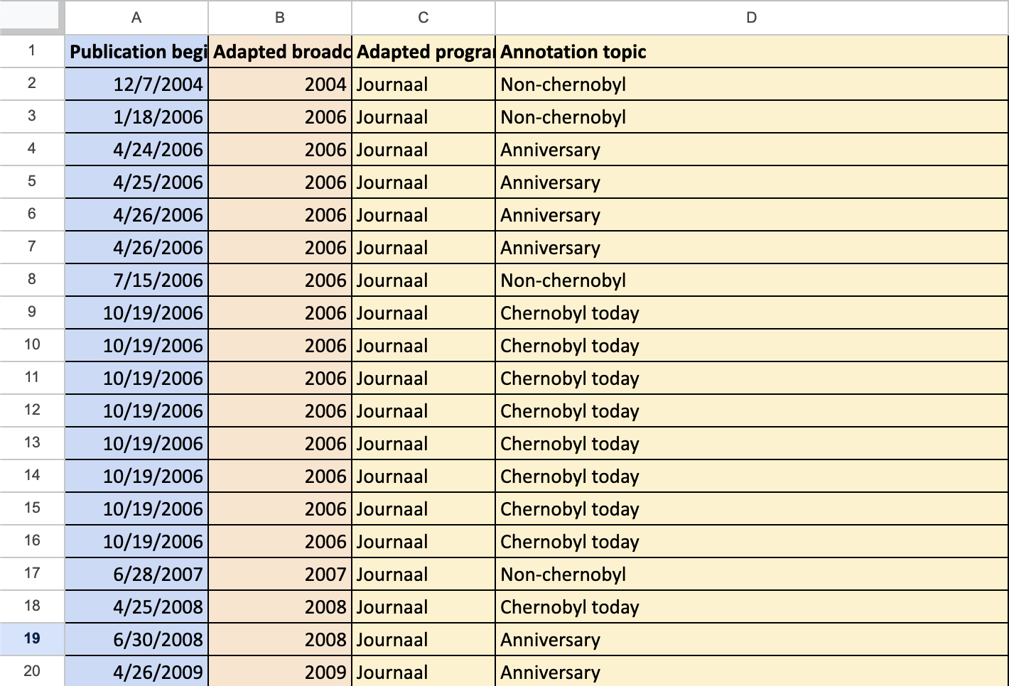
Open the example dataset . The first tab is the ‘ Curated dataset’ , where you can find the metadata we have received from the archive as well as our own annotations. This consists of straightforward information such as the program title and the date the program aired, as well as our own annotation regarding the main theme of the item.
- For an overview of the different metadata present, you can also go to your second tab called the ‘Data guide’ which provides a short explanation of the metadata included.
-
In our case, we want to create a visualization of the different themes we encountered in the Chernobyl news broadcasts and the years that these themes were present. While all files mention Chernobyl, this does not automatically mean that they center around the disaster. A visualization can map the different themes present as well as their occurrence over the years.
-
In this case, we have identified the following themes:
-
Anniversaries : Items that cover the memorial services commemorating the nuclear disaster.
-
Chernobyl today : Items that discuss the current situation in the area.
-
Fukushima : Items reporting on the 2011 Japanese nuclear disaster, which was often compared to the disaster in Chernobyl.
-
Non-Chernobyl : Items that are actually not about Chernobyl.
-
-
The last theme, Non-Chernobyl , is interesting and worth looking further into, as our selection is based on the mention of Chernobyl.
-
Inspect the second Non-Chernobyl item of 15-01-2015 at 8 p.m. by clicking here . Even if you cannot log-in, you will still have access to the speech transcripts of the news broadcast.
-
Click ‘Content annotations’, select ‘Speech transcript’ in the ‘Type’ drop-down menu, and search for ‘tsjernobyl’ (Dutch spelling of Chernobyl). Use Google Translate if necessary. What happened here?
-
Further explore this category by inspecting this broadcast that aired around 10 p.m. on 25-12-2013 and follow the same steps. Use Google Translate if necessary. What happened here?
-
-
Take a moment to reflect on what we can learn from this ‘Non-Chernobyl’ theme, and write down your ASR data critique. What do these errors tell us about ASR and the way this model is trained? Discuss whether you agree with our statement that “ASR errors can be considered traces of the archival production context.
Step 3: Preparing the data
-
In the example data set , copy-paste the data of the two tabs into a new Google Sheets file. We are using Google sheets so your lecturer can review your steps. Give your sheet a title that starts with your first name, and share your file through Google Drive so your lecturer is able to find it.
-
Your new file will be the one you can edit, and where you will make your visualization. Of course, you are also welcome using and experimenting with your own data set.
-
To create our theme visualization, we need some of the data from the example set. Open a new tab in your edit-file and copy-paste the following columns:
-
Column B: Adapted broadcast year: This will tell us the year the item was aired.
-
Column D: Annotation topic: This will tell us the main theme of the item.
-
-
Troubleshooting: If you encounter any problems in the following steps, ensure that column B: Adapted broadcast year is formatted as a single number. You can do so by selecting the entire columns, going to ‘Format’ and ‘Number’ and then selecting the ‘0’.
-
Now go through the data you have collected and prepared. If you look closely, you can see that in the ASR column, three items have been labeled ‘NOASR’, meaning that due to technical errors, these have not received any speech transcripts. As we are only interested in items with speech transcripts, you select these three rows, and delete them.
-
Your total number of rows should now be 125 (124 data and 1 title row).
-
You have just ‘cleaned’ the data by removing the failed ASR items. Take a step back and reflect upon what the deletion of broadcasts without ASR means. Discuss whether you agree with this step or not.
Step 4: Designing a table
-
In the next step, we make the table on which the final visualization will be based. It is important to ensure that each row and each column receive a total , and that the entire table receives a grand total .
-
In statistical terms, this grand total is the N-value . This value is mentioned in the title and caption of the final data figure. (e.g. N=124). It is important to always correspond this value to readers. Why do you think that is?
-
To make the variables, we first have to decide what type of visualization we want to make, and which data we need in order to do so. In this case, we want insight into the different themes present in the news items over the years , and we want to visualize this through a stacked bar chart.
-
In the same tab as you copied the data, we will create our table. Because of the formula you will be using, it is important to be aware of where you place your table.
-
We enter these variables in manually :
-
Put the topic category in the columns of your table. Start at cell G4 and work towards cell J4.
-
Put the year category in the rows of your table. Start at cell F5 and work towards cell F19.
-
Lastly, add a TOTALS row as well as column to your table.
-
-
Our columns now exist of the four topics: Chernobyl today, Anniversary, Fukushima, and Non-Chernobyl, while our rows exist of the years 2004-2017. This should look similar to the image below.
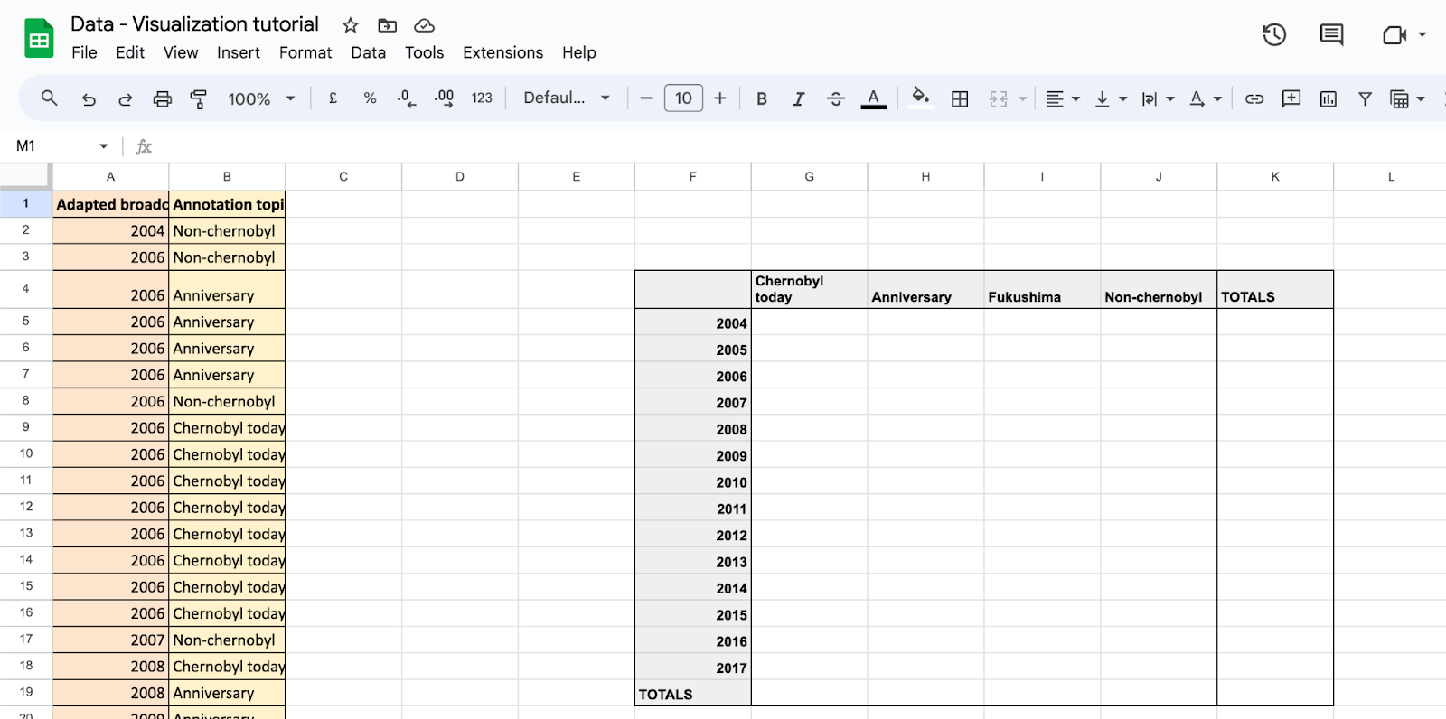
Figure 2: An example of what your tab is supposed to look like. Pay close attention to where you have put your table.
-
Now, we will fill in the table with the values. We can do so automatically, by using a specific formula. In this case, we use the formula COUNTIFS because we define the value, not for one, but for two conditions: the topic and the year.
-
In the first cell, regarding all Chernobyl Today items in 2004, our formula looks as the following: =COUNTIFS(A:A,F5,B:B,”Chernobyl today”)
- Troubleshooting: Ensure that the language of your file is set to either the United Kingdom or the Netherlands, as different countries use different interpunction-conventions in the formula’s. If you have your language set to the Netherlands: =COUNTIFS changes to =AANTALLEN.ALS
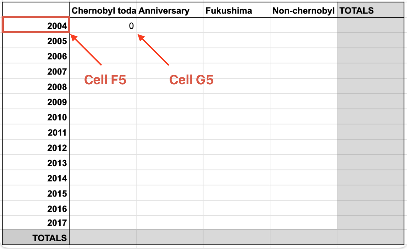
Figure 3: The location of your cells if you want to use the exact formula as described below. If your table is in a different position, the formula must be adjusted accordingly.
-
To break this formula down:
-
In our case, we would like to fill in cell G5: the value of Chernobyl today topics for the year 2004, which is located in cell F5.
-
The ‘year’ data is in column A of our file, and the year value of 2004 is in cell F5. Thus, select column A in its entirety by typing A:A and define its value via , as cell F5.
-
The topic of Chernobyl today that we are looking for is in column B of our data. Select column B in its entirety by typing B:B and define its value via , as “Chernobyl today”
-
Together, this makes the formula =COUNTIFS(A:A,F5,B:B,”Chernobyl today”) that will fill in this table value automatically.
-
Troubleshooting: The parentheses are important here.
-
-
You should be seeing value ‘0’ in the 2004 Chernobyl today cell. However, we want to fill in the entire table automatically. To do so:
-
We now copy-paste the formula we just created to all cells in the column Chernobyl today. This will adjust automatically to the right cells.
-
Troubleshooting: If it doesn’t work, you will need to adjust this manually. By changing ‘F5’ to ‘F6’, ‘F7’ etc. you will be able to fill in the rest of the column.
-
-
Now, we create the same formula for the other themes. This means replacing “Chernobyl today” with the name of the other themes (do not forget the parentheses).
-
We now have the right number of themes for every year, but we still want the totals . For this, we can also make use of a formula.
-
You can add the column totals by clicking on the TOTALS cell in question, and thereafter dragging your cursor so you select the entire column or row.
-
Then type in =SUM ( followed by the range in question and closed by a closing bracket. For our first Chernobyl today column this is =SUM(G5:G17)
-
Copy-paste this in the other total cells, as well as in the grand total cell.
-
The result should be as follows:
-
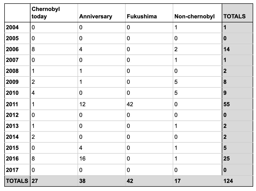
Figure 4: The final table.
- Do you want to go directly to step 5, or did you get stuck during step 4 , you can skip the line and copy-paste the data from this table.
Step 5: Creating the data visualization
-
When designing your visualization, you will want to choose the graph that best encapsulates what you are trying to say, in our case a ‘ stacked bar chart ’ will visualize the presence of themes over a longer period of time. We will create our visualization in the same tab as the table we have created.
-
To start our visualization, you need to select the range of your table.
-
First, you have to ensure that the years in your table are not included in the diagram as numbers. To do this, you select the years 2004-2017 in your column, select ‘Format’ then ‘Number’ and lastly ‘ Plain text ’.
-
Now drag your cursor over the entire range of your table, but leave out the ‘Totals’. Then click ‘Insert’ and ‘Chart’.
-
-
This chart will now be generated in your file.
- Troubleshooting: Ensure you have selected the right range (e.g. not the Totals).
-
Now that our chart has been created, it is time to adjust the design to our liking.
-
We select our chart type and choose: ‘stacked bar chart’.
-
We delete the chart title
-
-
Lastly, we will want to adjust our colors. When you are working with more than one visualization, ensure that you use the same color pattern throughout. In our case, we choose not to use primary colors for aesthetic purposes. When selecting yours, think about other possible motivations for the use or avoidance of specific colors. How can we be inclusive in our decisions?
-
To add your colors, select ‘Customize’ again, and then choose ‘Series’.
-
Choose the color pattern for each topic, in our case we selected blue, green, yellow, and purple
-
We select ‘line opacity’ at 0% and ‘fill opacity’ at 100%
-
-
Lastly, we write down a caption in which we clearly mention the N-Value , in our case N=124. Your chart should look something like the following:

Step 6: Interpreting the results
-
Now that we have our visualization, we are provided with a clearer picture on the prevalence of the different themes over the years. We can now reflect on what this visualization actually shows us, and what it doesn’t.
-
We can see three clear peaks. One in 2006, a high peak in 2011, and another one at the end of our diagram in 2016. What could the reasons for this be?
-
Compare the peak of 2016 with the peak of 2006. This actually tells us something about the televisual production process. What difference do you see, and how can this be explained? What does this tell us about “making old news ‘new’”?
-
What does this tell us about absences in the data? Think again about the criteria used to select this data. Are there broadcasts missing?
-
Also reflect upon the type of visualization we have chosen. What does this type of visualization highlight and which information is perhaps obscured?
-
Now you have reached the end of the tutorial. You have learned how to create a data visualization based on multiple metadata fields, while also conducting data criticism.